How to plot a bar graph on Gnuplot
Last updated on November 20, 2020 by Dan Nanni
A bar graph is a plot which visualizes data values using proportional-size bars. Bar charts are useful when you want to compare multiple items among different categories. As you can imagine, they are much more effective than a table of numerical data.
This tutorial discusses ways to draw a bar graph on Gnulot.
Assume that you have the following data file, from which you want to create a bar graph.
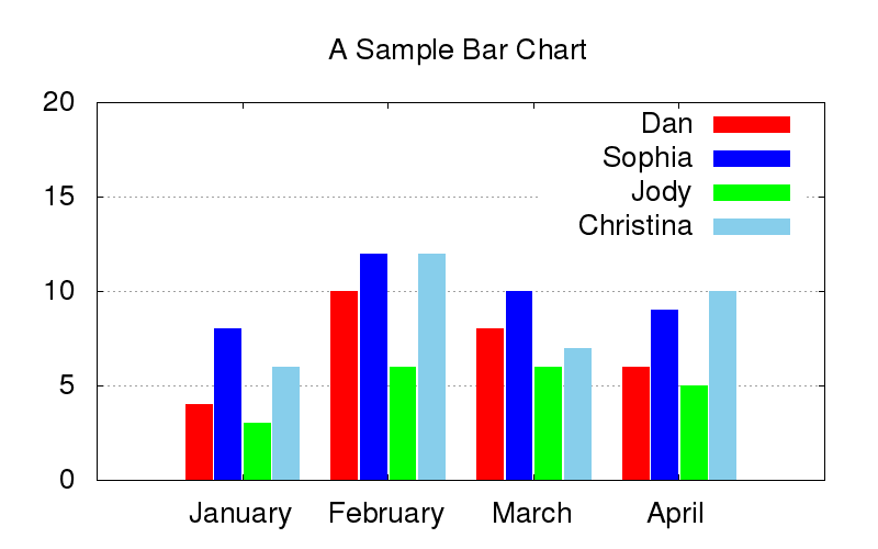
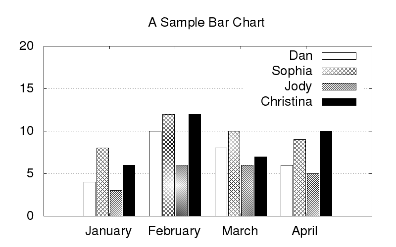
#         Dan      Sophia   Jody     Christina
January   4        8        3        6
February  10       12       6        12
March     8        10       6        7
April     6        9        5        10
The following Gnuplot script generates a bar graph using the above data file.
set terminal png size 800,500 enhanced font "Helvetica,20"
set output 'output.png'

red = "#FF0000"; green = "#00FF00"; blue = "#0000FF"; skyblue = "#87CEEB";
set yrange [0:20]
set style data histogram
set style histogram cluster gap 1
set style fill solid
set boxwidth 0.9
set xtics format ""
set grid ytics

set title "A Sample Bar Chart"
plot "bar.dat" using 2:xtic(1) title "Dan" linecolor rgb red,   \
     "bar.dat" using 3 title "Sophia" linecolor rgb blue,   \
     "bar.dat" using 4 title "Jody" linecolor rgb green,    \
     "bar.dat" using 5 title "Christina" linecolor rgb skyblue
If you want to plot a bar graph in black-and-white patterns, use the following Gnuplot script instead.
set terminal png size 800,500 enhanced font "Helvetica,20"
set output 'output2.png'

set yrange [0:20]
set style line 2 lc rgb 'black' lt 1 lw 1
set style data histogram
set style histogram cluster gap 1
set style fill pattern border -1
set boxwidth 0.9
set xtics format ""
set grid ytics

set title "A Sample Bar Chart"
plot "bar.dat" using 2:xtic(1) title "Dan" ls 2,    \
     "bar.dat" using 3 title "Sophia" ls 2,     \
     "bar.dat" using 4 title "Jody" ls 2,   \
     "bar.dat" using 5 title "Christina" ls 2
Support Xmodulo
This website is made possible by minimal ads and your gracious donation via PayPal or credit card
Please note that this article is published by Xmodulo.com under a Creative Commons Attribution-ShareAlike 3.0 Unported License. If you would like to use the whole or any part of this article, you need to cite this web page at Xmodulo.com as the original source.

Xmodulo © 2021 ‒ About ‒ Write for Us ‒ Feed ‒ Powered by DigitalOcean